By Philipp Nielsen & Maxim Weirich
This two-part essay, developed as a dialogue, deals with three deliberately differentiated approaches to using pictographic signs during the period from 1930 to 1990. We will begin by looking at the strong emotionalisation of graphic symbols under National Socialism and the use of early sports pictograms at the 1936 Olympic Games in Berlin. The pragmatic signage and information systems developed later by the studio of Otl Aicher (1922–1991) were diametrically opposed to the Nazi aesthetic and drew on the Bauhaus tradition. Aicher designed no-frills pictograms for the 1972 Summer Olympics that are still in evidence today as a blueprint for public signage systems in post-war Germany (Nielsen). Quite distinct from those pictograms, in turn, were the Lebenszeichen (Signs of Life) devised by the artist and graphic designer Wolfgang Schmidt (1929–1995) in the 1970s. Schmidt continued to expand and develop his pictorial writing with signs until it became a kind of visual poetry extending into every area of his life. He thus not only departed from Aicher’s functionalism but also ventured to charge his pictograms with emotion in an astonishingly similar fashion to today’s use of emojis (Weirich).
PICTOGRAMS, EMOTIONS, POLITICS
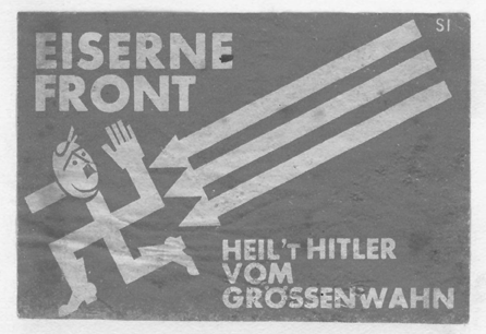
The emotionalisation of graphic design and the creation of pictograms were phenomena that developed out of advertising and in no small part out of politics. The Nazis deliberately appealed to people’s emotions in mass spectacles, “Führer speeches” and propaganda films, and this strategy was echoed in graphic form. In the Weimar Republic, election posters were often designed to elicit an emotional response from German citizens, with images increasingly supplanting text. The high point of this development was reached in the Reichstag elections of 1932 with a Nazi campaign image that was reduced to the essentials: Hitler’s head against a black background, with only his surname underneath. Along with Hitler’s portrait, stylised as an icon, the swastika was also taken up as a particularly suitable political pictogram, rivalled in instant recognition value only by the hammer and sickle of the KPD (Communist Party of Germany). Even more influential for the later development of emotionalised pictograms, however, was a symbol that has largely been forgotten today: the three arrows of the Iron Front.
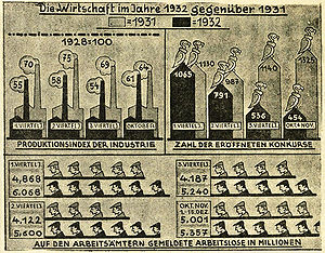
As part of the Anti-Anti, the defensive struggle against anti-Semitism, the biologist, sociologist, psychologist and political activist Sergei Chakhotin (1883–1973), who was of Russian origin, developed the symbol for the coalition of SPD (Social Democratic Party), Reichsbanner Schwarz-Rot-Gold and the General Federation of German Trade Unions. This reconfiguration of the swastika was meant to have an emotional impact on voters (Paucker 1966, 470–471). At the time, there were widespread efforts to systematically develop graphic design and particularly pictograms as a way to convey information, for example Otto Neurath’s ISOTYPE. Newspapers began using graphics as well, for example to illustrate economic trends during the Depression. After the Nazis seized power in January 1933, they carried on with these developments while continuing to devise their own visual propaganda, conjoining graphic design, emotions and politics.
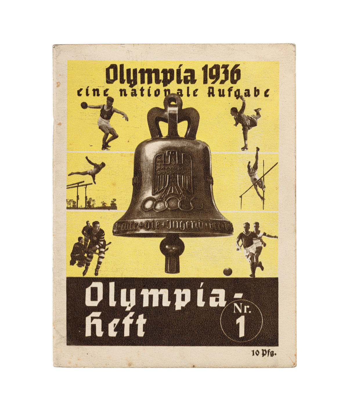
Impressive examples from the early years of the so-called Third Reich are offered by the “Stürmerkästen”, prominent red display boxes in which copies of the tabloid Der Stürmer with its anti-Semitic hate propaganda were posted for readers on the street, as well as public display boards exhibiting “The Nuremberg Laws” with their pseudo-genealogical representation of Jewish versus “Aryan” lines of descent, a theory devised for the Nuremberg race laws in order to distinguish citizens who allegedly had “German-blood” from “half-breeds” and “Jews”. Also worthy of note in this connection are the campaigns for the Winter Relief Organisation and for the Olympic Games 1936. On the covers of the Olympia Magazine published for the event, photomontages of athletes in typical postures against a neutral background created a sort of proto-pictogram for each of the 16 disciplines.
Far better known and more firmly anchored in collective memory than these relatively reduced pictograms was the emotionally charged propaganda spread by the so-called Third Reich, which made use of grotesquely exaggerated, caricature-like depictions. Whether pictogram or caricature, the Nazis put every creative form at the service of the Volksgemeinschaft, or nation (cf. Betts 2007, 23–73). Although the politicisation of graphic design had already begun during the Weimar Republic, its emotionalisation reached its cynical apogee under the Nazis with the glorification of war and the inhuman incitement to hatred of Jews.
DEMOCRATIC SYMBOLS: PICTOGRAMS AFTER 1945
After 1945, graphic designers in divided Germany faced a dual challenge. On the one hand, those in the Federal Republic in the west were expected to ground their work in the democratic constitution, meaning that complete depoliticisation after 1945 was not possible. On the other hand, politicians in the early Federal Republic, in contrast to those in the German Democratic Republic in the east, adopted a decidedly sober political style. Rationality and reason were deemed virtues appropriate to a democratic society, especially after the intoxication of National Socialism (Nielsen 2015, 35). The designers toed this line but retained the inherent political aspect of design, under the premise of rational and functional “good form”. While associations like the Werkbund acted rather conservatively, the Ulm School of Design, co-founded in 1953 by Inge Aicher-Scholl and Otl Aicher, saw itself as a decidedly progressive institution (Betts 2007, 89). The versatile Inge Aicher-Scholl, eldest sister of Sophie and Hans Scholl (who were executed under the Nazis in 1943), and her husband, graphic designer Otl Aicher, pursued the goal of educating a new generation of democratic citizens. A scholarly analysis of design principles and a focus on information design were to play an important role in their teaching. As early as 1946, six years before their marriage, the two had already joined with others to found an adult education centre in Scholl’s home town of Ulm. The centre relied on the involvement of the participants to help shape the political, social, cultural and community life of the city (Betts 1998, 67–68). From 1953 until its closure in 1968, the Ulm School of Design endeavoured to develop modern design for a democratic society. This involved frequent debate on central theoretical questions: How closely should designers cooperate with industry? What role is played by the artist’s own ideas? Which scientific methods should be applied? Contradictory positions on these questions, along with the growing unwillingness of the state of Baden-Württemberg to finance an increasingly theoretical and experimental curriculum, led to the closure of the Ulm School of Design in 1968 (Betts 1998, 81). Despite all the controversy, those involved in the school did agree on one point: that design should be rational and not emotionally motivated. Otl Aicher and others understood information design as an impersonal language. Graphic design should be based on rules and not feelings (Betts 1998, 81; Jacob 1988, 228; Holt 2019, 2).
At the time of its founding, the school still worked within what was generally seen as a desirable combination of politics and emotions. And yet the ideals of sober and objective communication, intended to prevent the masses from slipping once again into hysterical emotionalisation, were increasingly called into question. The warnings voiced by the French sociologist and psychologist Gustave Le Bon, who in 1895 had analysed the dangerous susceptibility of the masses to seduction in his work Psychologie des foules, still rang in the ears of designers in the early years of the Federal Republic, but then began to fade away just two decades after the war. Broadly speaking, the protest movement that took flight in 1968, despite all its own group dynamics, symbolised a process of stronger personalisation and emotionalisation of social expression. This also brought about greater acceptance of emotions in the political arena. Taking place in parallel was a general reassessment of feelings, which were no longer seen as harmful, irrational and, worst of all, susceptible to manipulation but rather as an authentic expression of the self and quite capable of guiding action. This was reflected on the one hand in the “New Age” with a new understanding of body and self, and on the other in how emotions such as fear – for example of a nuclear war – were now recognised as a legitimate motivation for political action (Biess 2009, 242–243; Eiter 2017, 166–167).
Interestingly, what are arguably Otl Aicher’s most important graphic works were executed during this period, which began in the mid-1960s. This raises the question of the impact of these changes on his designs, seeing as he would have a seminal influence on the field of visual communication as taught in Ulm, where he was director of the design school from 1962 to 1964. In addition to his teaching, Aicher developed the information and signage system for the Hamburger Hochbahnen public transport system and also took on commercial commissions such as designing Lufthansa’s corporate identity, from typography to onboard cutlery.
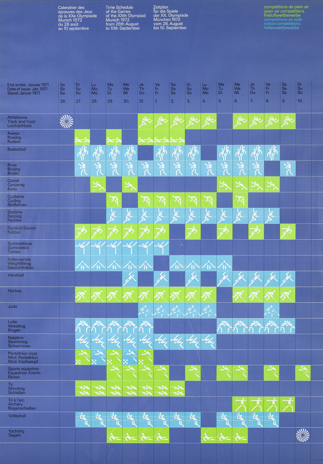
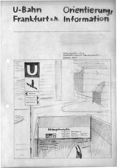
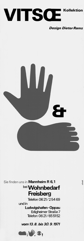
The careers of Otl Aicher and the aforementioned Wolfgang Schmidt, who designed the information system for the Frankfurt metro network in 1967 and the corporate identity of the furniture maker Vitsœ in 1970, still seemed to run parallel at this point. But the contrast between the generally reduced Lufthansa livery, in which Aicher viewed his own somewhat whimsical “fried egg” on the aircraft’s tail quite critically, and Schmidt’s kissing mouth for Vitsœ already shows them taking off in different directions (Aicher 1991, 161). This becomes even more evident when we consider Aicher’s pictograms for the 1972 Olympic Games in Munich, created for the most part after his time in Ulm and more or less concurrently with Schmidt’s first Lebenszeichen (Signs of Life).
In his previous works, Aicher had already tried to distance himself from the basic geometric forms that the Bauhaus had envisioned as the principle behind graphic design. Aicher found this approach to be too close to formalism and to art, and too remote from the aim of communicating information in a clear and legible manner (Aicher 1991, 94). For him, design was not a matter of taste or personal sensibilities but of rational arguments. Several decades later, he would write about the colour scheme chosen for the 1972 Olympic Games:
which colours we should choose for this colourful event was therefore not a question of taste or following a trend but a matter of clear argumentation. we could say precisely why the colour scale had to look like this and not otherwise; we had developed a philosophy (Aicher 1991, 164). It was furthermore necessary to design for the Games a coherent and self-contained information system that would function as a complete syntactic language – an approach that Aicher had first developed in his work for Lufthansa in 1962 (Meggs & Purvis 2016, 1072).
1972 SUMMER OLYMPIC GAMES: DEMOCRACY AS GUIDING PRINCIPLE
For the branding for the 1972 Olympic Games, Aicher was able to draw on designs executed by both Masaru Katzumie and Yūsaku Kamekura for the 1964 competitions in Tokyo and also on works by Otto Neurath. In contrast, Lance Wyman’s designs for the 1968 Olympic Games in Mexico, although philosophically more in keeping with Aicher’s aspiration to develop a complete communication system for the city, are closer in their loose and casual style to Wolfgang Schmidt’s Signs of Life and seem to have had little influence on Aicher’s work (Meggs & Purvis 2016, 1087).
Even though the Olympic competitions in Munich were planned as “light-hearted games” where the spectators would be able to move freely across the hilly terrain of the Olympic Park without a fixed network of paths, and Aicher accordingly wanted to emphasise the playful aspect of sport in his pictograms – in contrast as well with the 1936 Olympic Games – the urban planning and design involved were nonetheless marked by systematic thinking and rules.
It is precisely the tension arising from the dynamics of the athlete pictograms when placed next to each other and their absolute typification that makes them so interesting and also classic products of their time. In these twilight years of the Wirtschaftswunder, or economic miracle, faith in a systematically plannable future had not yet quite been dashed completely, in particular perhaps in democratic societies.
In the early 1970s, the euphoric belief in progress and planning would then encounter increasing challenges, on the one hand Willy Brandt’s new policy of “Let’s take a chance on more democracy” and the rising social movements, and on the other the economic impact of the oil crisis.
Although Aicher’s pictograms for the games have in the meantime attained iconic status, his claim at the time that he had created a Gesamtkunstwerk (total work of art) is dubious when we consider the mascot “Waldi”, which certainly had nothing to do with rational or systematic design. Aicher’s objective was furthermore brutally thwarted when Israeli athletes were taken hostage at the Games and murdered, whereupon the image of a masked member of the Palestinian terrorist organisation “Black September” likewise became a media icon (Schiller & Young 2010, 196, 261 N94). The two opposite poles represented by “cute” (Waldi) and “deadly” (hostage-taking) mark the outer limits of the systematic language of signs as a form of communication capable of promoting democracy. Wolfgang Schmidt’s Signs of Life had by this time already left the realm of politic statements to devote themselves to the self-referential individual and the experience of the world through one’s own body.
UNDERSTANDING WOLFGANG SCHMIDT
It is well worth taking a closer look at the nearly forgotten Signs of Life created by the artist and graphic designer Wolfgang Schmidt in view of today’s rampant use of pictograms. Ever since the standardisation of emojis by the Unicode Consortium in 2009 and their incremental implementation on virtually every digital device, emojis have become an integral part of digital communication (see the essay by Lukas R. A. Wilde in this publication). They continue to be refined and differentiated further in annual cycles, resulting in an increasingly complex catalogue of signs that aims to bring together the greatest possible variety of areas of life, emotional states, and the different sociological and cultural characteristics of its users.
Whether used in a text or strung together on their own, emojis enable users to enhance personal statements with the aid of visual pictograms. Before emojis were introduced, few people had direct access to such a pictographic tool. This perceived lack motivated Wolfgang Schmidt, forty years before emojis would experience their breakthrough, to define and design his own catalogue of signs relevant to himself and his own intellectual and creative interests.
In their formal structure, the Signs of Life he conceived follow the “design principles of clarity and rationality through a systematic design approach” (Meer 2015, 97), as demanded by the Ulm School of Design. They are formulated as a system with an underlying grid that steers them along uniform paths and makes them expandable and combinable thanks to a coordinated formal language and proportions. But their conception and application went even beyond that. Schmidt claimed that he had completed between 1972 and 1979 a total of 262 of the 893 signs he had originally planned, which he collected in a metre-long card index. Starting with his own body, he thus developed over the course of decades his own pictorial sign system: “An attempt to measure the cosmos of experience. A gigantic project” (Brackert 1979).
In the 1974 project portfolio for the Signs of Life, Schmidt wrote: “[...] content: almost everything humanly possible, impossible: (what one is has can: in and of oneself as oneself apart from oneself) sensual, non-sensual, profound, senseless, transcendental, moronic etc. thisandthat. nowandthen. hereandthere. anyway. why? because [...].” He added: “[...] at the beginning, the project had the working title kom.zeichen, until i realised that i was on the wrong track: it wasn’t meant to go in the direction of illiterate / schoolbook / building / marketing communication but rather to become a plaything for all sorts of things – perhaps something like visual poetry. friends liked the alternative title signs of life. so it stayed. [...] with everything i do i want to tell stories. it’s a game”.
While in Germany the signage and sports pictograms devised by Otl Aicher entered the public space and thus the public consciousness, Schmidt designed his Signs of Life for a much more intimate form of communication – to convey the inner world of feelings and thoughts to the outside world. In retrospect, it thus seems that he was already working in the 1970s on analogous predecessors to the emojis, in the process shifting the field of use by making his signs distinct from functional signage tasked with creating “order” in society.
THE ROAD TO THE SIGNS OF LIFE
Born in Fulda in 1929, Wolfgang Schmidt began study-
ing at the State Academy of Fine Arts in Stuttgart in 1950 but then switched to the Kunsthochschule Kassel in order to study for two years with Hans Leistikow, a graphic designer who co-founded what is known as the Kassel school of poster art. After teaching as a guest lecturer for a time at the School of Arts & Crafts in Reykjavik, where he met Dieter Roth, he did freelance work in Kassel and later in Frankfurt am Main. In 1964 Schmidt exhibited at documenta III in Kassel (Jaaks 1992, 413).
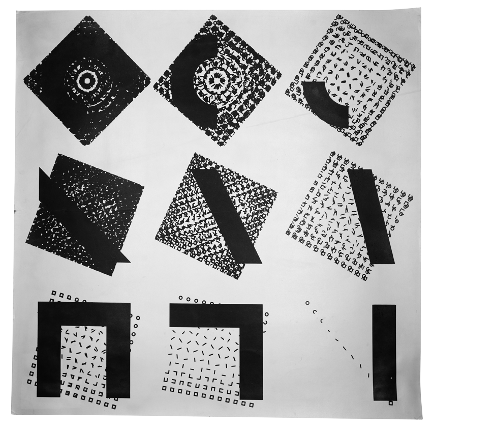
It was during this period that he developed his highly systematic approach, leading to serial works in which geometric shapes or letters undergo a process of transformation according to predefined rules: “There is no final form in Schmidt’s series, only a starting point and a method. His main interest is in the design process itself – the action – the making of pictures” (Nauman 1966). Applied graphic design and independent artistic creation were closely linked for Schmidt from the very start (Stürzebecher 2008). In 1959 he joined the graphic designers’ association “novum – Gesellschaft für Neue Grafik mbH”. Taking an artistic approach to commercial graphics seemed to interest him more than a strict separation of disciplines. The novum collective recorded in the programme it issued upon its establishment in Frankfurt am Main in 1958:
Commercial graphic art is only complete and fulfils its purpose as advertising when it succeeds at synthesising functional and artistic factors. [...] Good commercial graphic art is rare, because it presupposes the ability to decisively solve a specific task by exercising the artistic imagination (Bott 1960). Through the mediation of novum GmbH and the graphic designer Hans Hillmann, Schmidt obtained work in the 1960s designing film posters for the Atlas Filmverleih and the Verleih Neue Filmkunst Walter Kirchner, among other commissions (Müller 2009, 298). In terms of systematic design in public space, the conception of the signage system for the new Frankfurt metro network with lines A and B in 1967 was an important contract for him and his novum colleague Hans Michel. That Schmidt was at home in both worlds is also evident from various projects in which he both exhibited as an artist and designed the catalogues and posters for the respective exhibition.
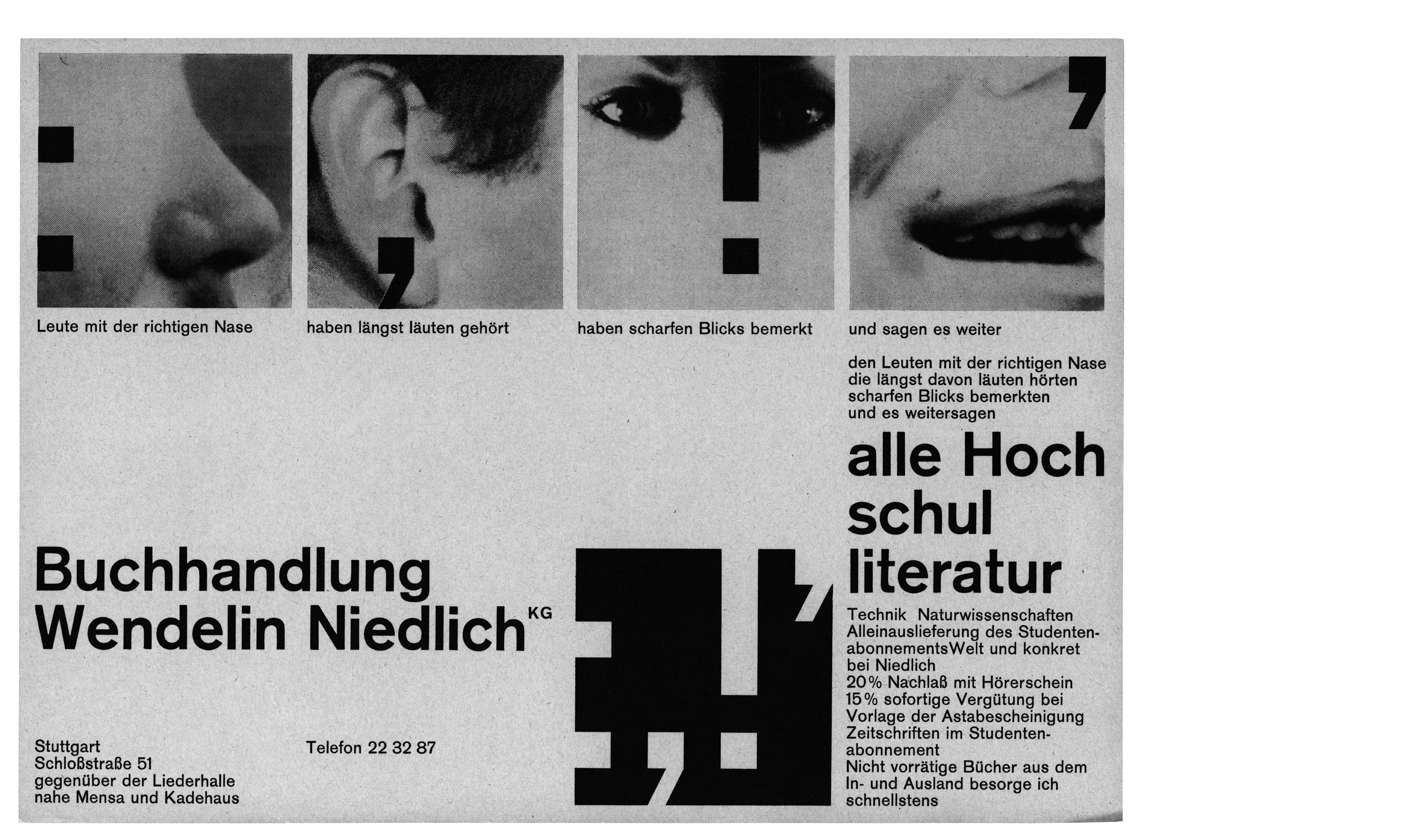
In addition to his systematic approach to art and design, Schmidt’s affinity for Concrete Poetry is also of note in understanding the conception and application of the Signs of Life. His use of linguistic elements followed similar principles to his handling of geometric shapes. The incremental addition or omission of individual fragments changes words or sentences and thus their meaning in a serial process. As Rolf Lobeck noted in an interview in the early 1990s: “The random, playful handling of language was his second point of origin. And this is contrary to constructive order” (Jaaks 1992, 46). The Concrete Poets Schmidt associated with, such as Franz Mon and Hansjörg Mayer, as well as the artist and graphic designer Helmut Schmidt Rhen, had a considerable influence on Schmidt’s handling of written characters and his Signs of Life. Wolfgang Schmidt designed a visual identity and advertising material for the Wendelin Niedlich bookshop and gallery, an important gathering place for the Stuttgart group around Max Bense. He also exhibited a few times at his friend’s gallery.
DESIGN AS PHYSICAL SELF-AWARENESS
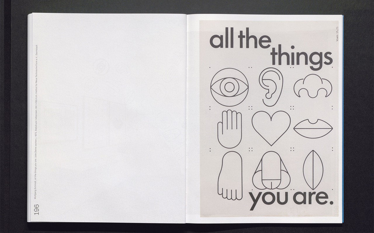
Even before the Signs of Life were shown in solo exhibitions in Stuttgart in 1975, Berlin in 1977, and Frankfurt in 1979, they appeared in a preliminary stage in Schmidt’s work for the furniture makers Niels Vitsœ and Otto Zapf. In 1961 he began doing graphic design commissions for Vitsœ & Zapf, and starting in 1969 he left his mark on the corporate identity using pictograms. The red pictograms Schmidt designed, including an eye, hand and foot, became an integral component of the posters, catalogues, display boards and invitation cards he developed for Vitsœ. They are still part of the corporate identity even today and can be found on the company website.
In their use, the pictograms form an interesting counterpoint to the furniture designs of Dieter Rams, which are still sold by Vitsœ today – for example his famous 606 shelving system. In keeping with Rams’s “Ten Theses for Good Design”, his furniture is neither playful nor whimsical. It instead embodies the functionalist design precepts of German post-war modernism, for which the Ulm School of Design and Otl Aicher laid the theoretical groundwork.
What initially seemed to motivate Wolfgang Schmidt in the use of his signs was the activation of perception by connecting with one’s own body: seeing – touching – feeling. Good design as physical self-awareness. It is exciting to see on the one hand how playfully and freely the pictograms for Vitsœ were deployed, and on the other hand, how Schmidt would transform this contract work in the years to come into a complex visual system integrated into his artistic practice.
STRUCTURE AND EXPANSION OF THE SIGNS OF LIFE
Schmidt developed his signs by applying a similar systematic approach to the one he took to creating Vitsœ’s corporate identity. For this purpose, he made portfolios in DIN A4 format in which he itemised the function of the signs: overview, contents / ordering elements (module) / development, modification / catalogue, alphabetical photo characters. The overview and contents sections of the Signs of Life portfolio from 1974 were followed by the definition of the design principles for visual components such as grids, line thicknessesw and basic shapes from which the signs are composed. Then came development and modification of the signs as well as an alphabetical catalogue showing their written meanings. Schmidt took himself as starting point for this alphabetical index of the things, characteristics, body parts and persons in his environment and his thoughts.
The transfer of the signs into different print and media formats, for example in the Signs of Life portfolios, would play a decisive role in the use and further development of the signs in the following years.
BODY:
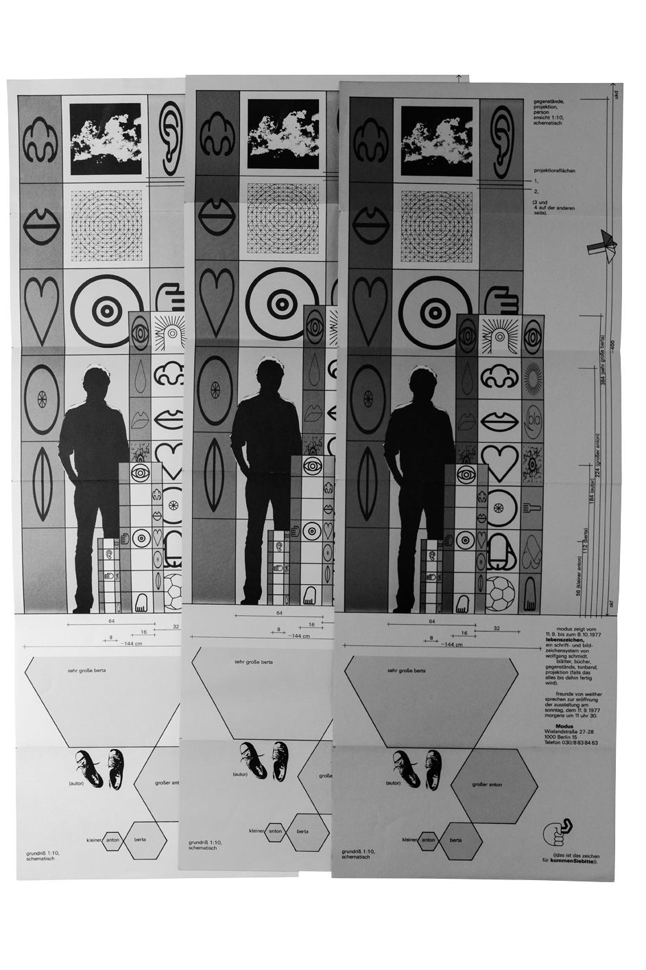
At Modus Möbel Berlin, Inez Franksen exhibited in 1977 under the title lebenszeichen. ein schrift- und bildzeichensystem von wolfgang schmidt (signs of life: a writing and pictorial sign system by wolfgang schmidt) the Signs of Life arranged on hexagonal sculptures. Schmidt’s own silhouette complete with dimensions is depicted on the invitations to the exhibition. They show the proportions of the sculptures in relation to their author. Schmidt would go on to expand or project his two-dimensional signs into space as large-format sculptural works on other occasions as well, including for a show at the Frankfurter Kunstverein in 1979 and another at the Institut für Neue Technische Form in Darmstadt (INTeF) in the year 1981.
SHEETS:
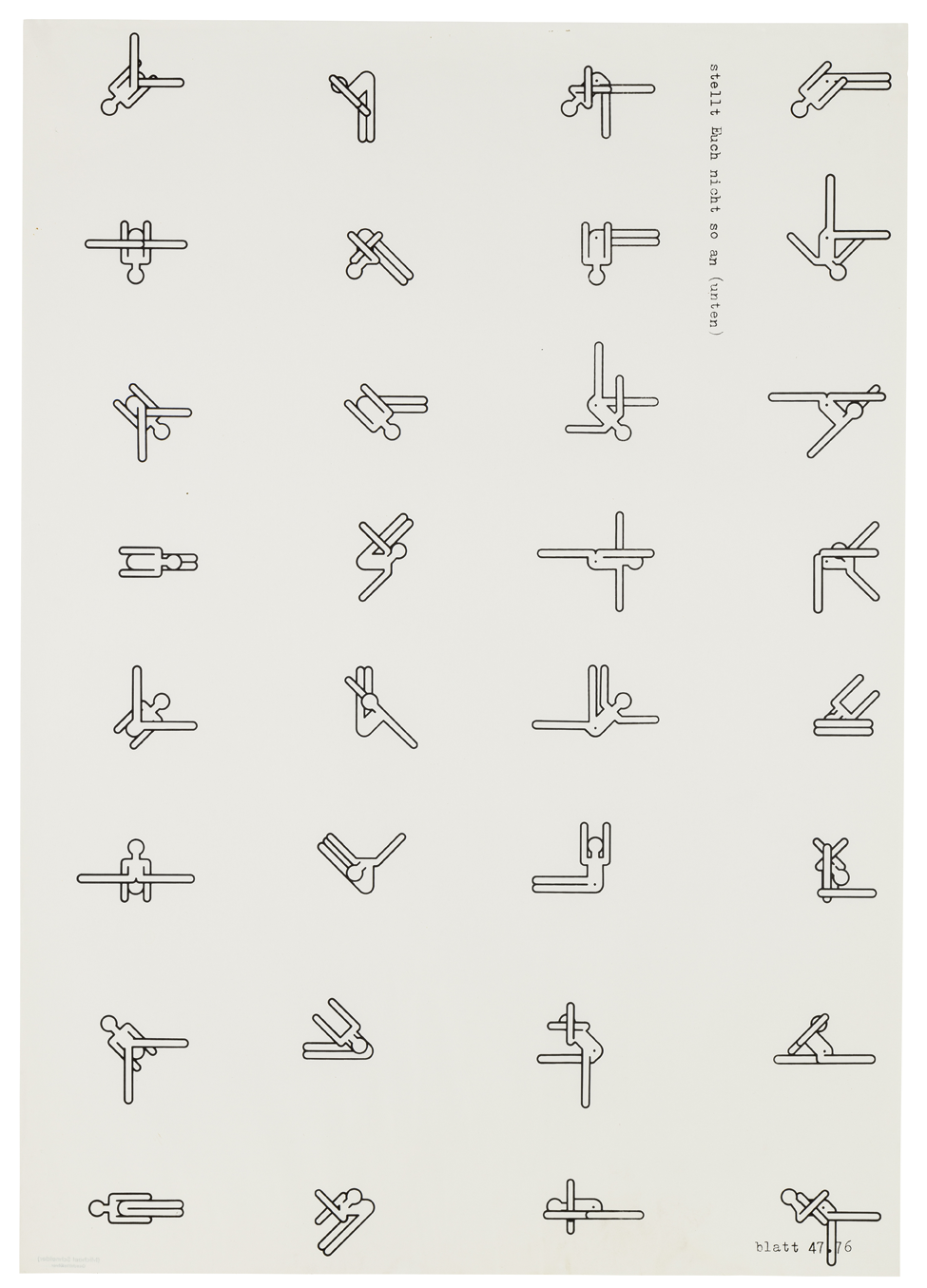
From 1976 onwards, the Signs of Life also included figures called “human signs” that strongly recall Otl Aicher’s sports pictograms. In these poster works, Schmidt parsed the possible movements of the figures in a serial sequence and added the words “don’t make such a fuss”. This can be understood as an invitation to the signs in orientation systems to break out of their function and move around freely or even dance.
INTERIOR PLANNING AND WALL INSTALLATIONS:
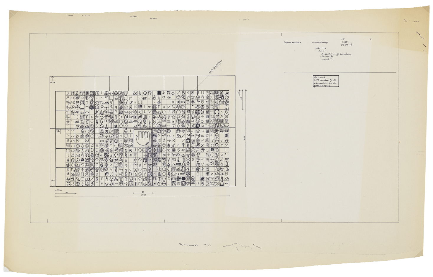
For the exhibition of Signs of Life in 1981 at the INTeF, Schmidt conceived a wall installation based on detailed hand-drawn plans. The left depiction shows a sketch-like overview of the signs arranged alphabetically for one wall of the exhibition, and the right depiction shows a photograph of a wall sculpture projecting into the room, composed of nineteen 60 × 60 centimetre silkscreens of the Signs of Life.
HEARING:
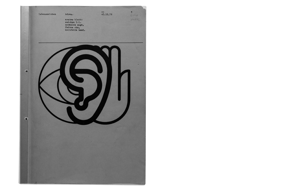
The portfolio Lebenszeichen hören (Hearing Signs of Life) from 1976 contains notations for a sound work Schmidt created for a radio programme broadcast by the Süddeutscher Rundfunk in March 1977. Here he explicitly contemplated how to transform graphic signs into sound signals. The properties of the signs used have a direct influence on the sounds; for example, line thicknesses ranging from thin, light or regular to semi-bold, bold, very bold, overly bold, super-bold to greasy determine the volume at which the sounds are to be played.
CONCLUSION:
This fluidity, the ease of transfer to different formats, is an essential component of the Signs of Life. Schmidt developed them out of his own life and thoughts and not for a global user community. If a sign was missing, he added it, redesigned it on the basis of the grid, constructed it out of others, or left it in sketch form. Perhaps it is due to this very fluidity and Schmidt’s artistic interest in the process itself and in serial works that the approximately 300 Signs of Life he designed fell far short of the 900 he had planned. Nevertheless, Schmidt anticipated with his Signs of Life the more than 3,000 emojis developed later to represent individual feelings, objects, states etc. – “almost everything humanly possible, impossible”, i. e. elementary.
